ShopDreamUp AI ArtDreamUp
Deviation Actions


Description
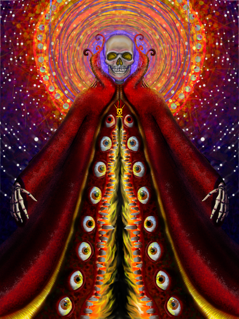
I did this on my iPad with ArtStudio and the Hex3 Jaja stylus. Hope to do more soon.
Image size
768x1024px 1.63 MB
© 2012 - 2024 ElizabethBarndollar
Comments1
Join the community to add your comment. Already a deviant? Log In
Hi. This vibrantly colored picture definitely caught my attention and I felt I had to critique this. I have just about no experience as a digital artist so im afraid I cant provide a critique specified for such but as a visual (traditional) artist, I thought my input might still be of some value.
One thing I think that stuck out most about your style is the fact that you are extremely aware of detailing when it comes to lighting and color value. Also one thing I always really liked about certain art pieces is that whenever I look at a picture again I learn a little bit more about it, or see details I have overlooked or haven’t appreciated.
Now to focus on your technique… The texture overall wasn’t bad. The skeleton was a bit plain, but that’s not a big deal. It would’ve just added character. I have to say though the texture of the coat was instantly recognized in my brain as if I could feel it, and the way you gave a glossy look to all those eyes was very impressive. As for the darker red area around the eyes, this is only a suggestion, but I would find this picture a lot more fascinating if you have captured that fleshy pinkish membrane look. The reason why I actually want to make that just a minor suggestion though is because when I looked at this composition as a whole, I felt that you toned it down or held back when it came to making this a horrifyingly vulgar painting. I don’t mind it that much because I feel like that helps this picture be less frightening for children and squeamish people. But perhaps in the future you could use this as a reference to take another route that would make fans of dark art like me satisfied.
The color choice was great because it was vibrant yet not innocent but mysterious.
One thing that kind of bothered me while I was examining this picture was the fact that the skull seems so rushed and was not given enough attention too just as the rest of the picture was. A specific area in that is the outline of the skull. I know it helps the skull pop out more so it doesn’t blend into the background yet it had a crayon like look which looked pretty cheesy. The teeth area also looks pretty bland and two dimensional.
As for the anatomy, I thought the proportions were very well fitting. Just a random note, it’s refreshing to see art with more realistic proportions like this considering the fact that anime and manga styles flood this site like no other. But I noticed something subtle. The entire skeleton being is pretty stiff, which although you did a great job with detailing him, the stiffness can take quite a bit of impact out of the composition.
As for the background I want to say that I’m glad you are one of the few artists that truly give attention to it. Many brilliant artists have the most amazing middle grounds and foregrounds but often leave the background blank. As I recall while watching an interview on some person that hires artists (I think it was for a gaming company), they are always keen on looking for talent that has decent background skills. One thing I personally felt was a little off putting was the noise in the background. Whether or not you went for a quiet background or one with action going on it still had a cluttered feel.
Well I’m done giving you all the general feedback I can give at the moment for technique so I’d like to move on to originality. You might already suspect this coming but skeletons are hardly original. This painting is still unique though, but that is only on account of your unique style. So although the idea for the painting was unoriginal I still have to give you credit where it is deserved.
Overall I was pretty impressed with this digital painting. Like I said I have no experience with this medium but this kind of makes me want to give it a try. Hopefully my general observations were of some help.
Keep it up!
Sincerely, KOIBEAT